Logo Simplicity – The Common Trait of All Good Logo Designs
When it comes down to the best logos, they all share one thing in common: logo simplicity. Logo simplicity usually results in a one-color simple design that is easily readable, reproducible and scalable. Learn how to make Creative & Effective Logo Designs if you haven’t already. Here we are going to focus on making simple logo designs that will compete with the best branded companies.
A Logo Simple Enough for Any Size
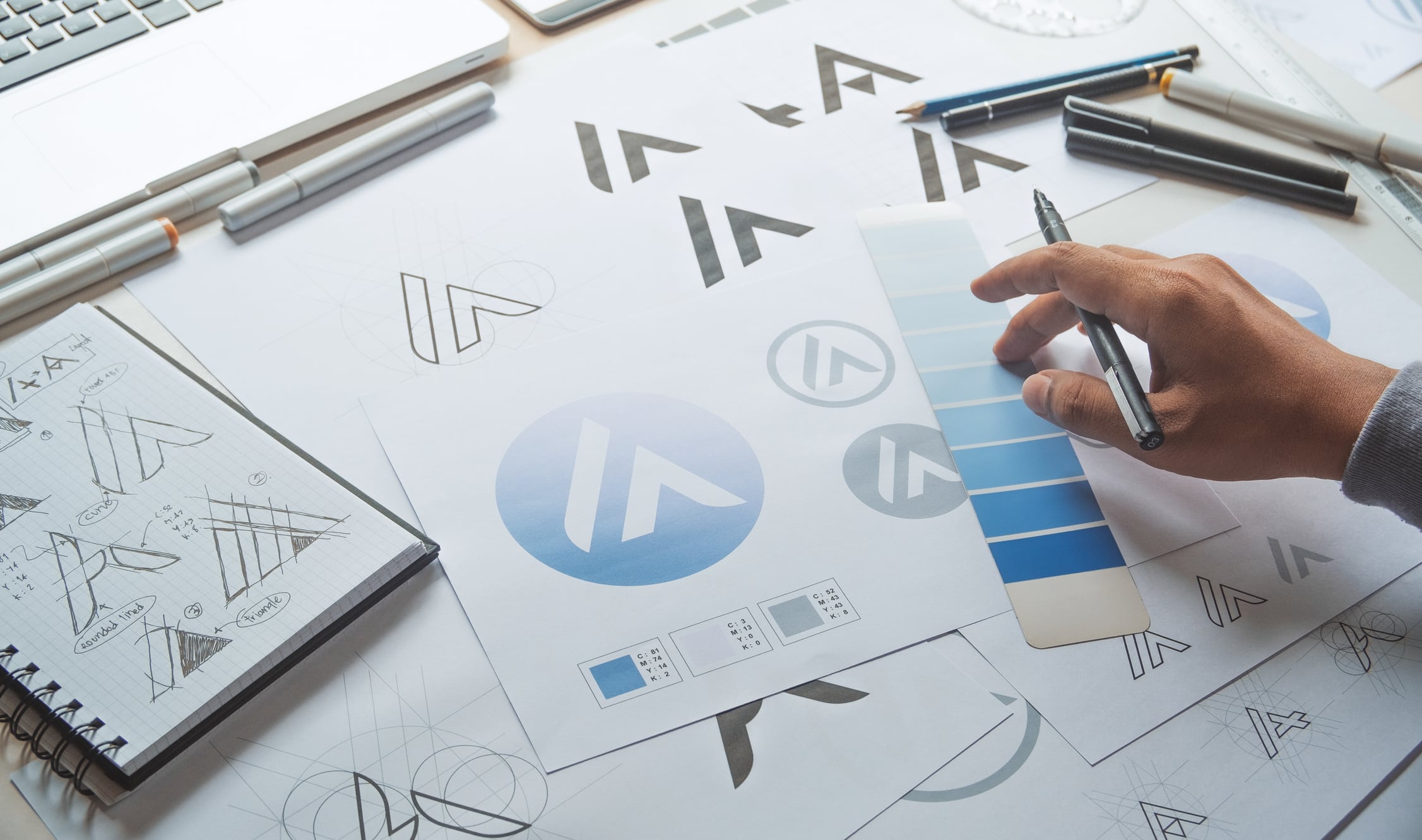
Will your logo work on a golf ball and on a pencil? Golf balls and pencils both have challenges: they are small, they don’t have smooth services, they are different sizes and there are millions of them. Golf balls are round, pencils are long; Golf balls have dimples; pencils have ridges. Golf balls end up on the same green as other golf balls, and pencils end up in the same pencil holder as others. How would your logo look on a golf ball and a pencil? Would it stand out?
There’s not room for much detail or color. There would certainly be distortion from those bumps and ridges–how forgiving is your logo? Your logo needs to be unique, yet simple enough to make an impression while people are whacking your ball hundreds of yards or writing a paper with your pencil.
A Logo should work as well in Black as it does in Full Color
Gradients and photos are wonderful but when you put them in a logo, you’re asking for disaster. Not only will lots of colors look bad on your golf balls and pencils but they will cost a lot more to make and reproduce.
A Logo with Type and a Symbol
The Nike Swoosh did not become recognized world-wide over night. In fact, Nike used the swoosh symbol with the word NIKE for years before using the swoosh symbol on its own. If you’re designing a new logo or re-designing an existing logo, you should probably include both the mark and the name of the company so that people will begin to associate your mark with your company, organization or product. Overtime, there may be enough recognition to drop part or all of the name.
Remember to make sure your type and symbol have a good size ratio so that they can both be easily seen when the logo is reduced in size to fit on those golf balls and pencils!
Share this post
Newsletter Sign-Up
"*" indicates required fields
We build brands stronger, fueled by creativity, and inspired by people.
We focus on transforming consumers into believers.
About Us
Johnny Flash Productions
Johnny Flash Productions is a creative agency based outside of Washington D.C. that focuses on digital strategy, web design and development, graphic design and event production that helps businesses get better results from their marketing.

Johnny Flash did great work getting us set up with a logo, branding info, and making adjustments to our website so we are well positioned online for a long time to come.

John and his team at Johnny Flash Productions did an amazing job on our new company website! John was very patient and professional throughout the entire process and always responsive to any request we had.
I would definitely recommend their services to anyone looking to create a website!

John, Joli and the rest of the team have been doing fantastic work for my e-commerce business since they first started handling our monthly maintenance, update, and support needs nearly 2 years ago. Because of that, we went to them when we needed a full site redesign, and we were thrilled with that project as well. Highly recommended!!

Universal Athletic Club in Lancaster Pennsylvania has been working with Johnny Flash Productions for years. We were in need of a complete website redesign and after researching our options decided to have JFP take on the project.The new design is very consistent throughout, with all of the pages clean, modern and easy to read. Universal has an extensive amount of offerings, with many diff. audiences, which made the arrangement of information crucial to the success of the project. This new site appeals to the average person making everything very easy to find. Everything was done in a professional, business like manner with lots of interaction from pre-planning through post launch edits of the new website. JFP also takes care of our Google ads and website SEO. Having a knowledgable and responsive company to work with has been a wonderful addition to our ever changing marketing strategies.

Efficient, effective and professional - Johnny Flash Productions did an awesome job of rebranding and migrating our WordPress website. We launched last week and there is positive feedback all around for the sleek, new, mobile friendly look.

We cannot speak highly enough about Johnny Flash! As a small nonprofit, hiring professional help can be a challenge, but Johnny Flash has been worth every penny. Their team does an excellent job maintaining our website, ensuring it runs smoothly and looks fantastic. What truly sets them apart is their incredible customer support—always responsive, professional, and ready to help at a moment's notice. They've made our website management stress-free and efficient. Highly recommend their services to anyone looking for top-notch expertise and care!

I recommend Johnny Flash Productions because they respond promptly and with honesty when requesting their services, they are very professional and I am a satisfied client!
They fulfilled my expectations with the website and branding project. It has already been a success and helped us reach our goals for our business. Thanks Johnny Flash Productions.

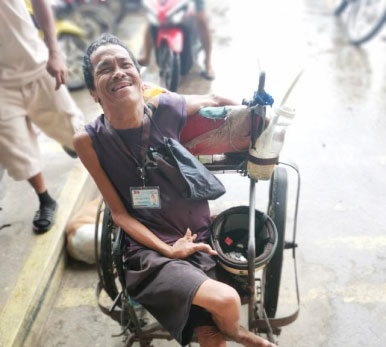
Joseph is living by himself after his family left him following his inability to walk due to a polio infection. He solely relies on the kindness of those around him. As we presented him with money, his broad smile and teary eyes conveyed his deep gratitude and happiness.
We met Jimmy working at a fast food restaurant. He lost his son, has no family, and has been unemployed. We provided him with financial assistance and are praying that our actions will be a tangible expression of the love of Christ in Jimmy’s life.
The team at Johnny Flash was terrific. They guided me through the entire process and created a website that perfectly met my company's needs.

John and his team do top quality design work, website work, and just about anything you would need to have a dynamic presentation in both print and digital media. Incredibly talented and innovative, you can call him with a "thought" that comes back to you better than you ever imagined. Truly professional and talented, I could not recommend more highly.

We found Johnny Flash Productions to be professional and a pleasure to work with. Their industry knowledge and creative approaches were incredibly helpful.
Our new website exceeds our expectations and we look forward to continuing our relationship with Johnny Flash Productions with their responsive and ongoing website upkeep, maintenance and SEO.

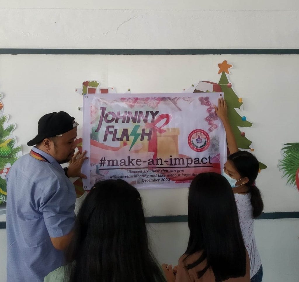
We gave 68 students from an underprivileged school in our city school supplies, books and a meal. Our goal was to make their Christmas season happier and memorable. They will now look back and remember someone remembered them.
John Falke and Johnny Flash were incredible to work with and produced a very professional and progressive website for Covenant Park Consulting and were completely responsive to our vision and goals.

At the Cigar Association of America, Inc., we have partnered with Johnny Flash for website support, development, and graphic design needs. Their team consistently exceeds our expectations with their creativity and ability to transform our ideas into designs that are even better than we imagined. Both their web and graphics teams are exceptional and truly the best in the business!

Johnny Flash Productions has developed several websites for us over the years and helped us with rebranding and creating logos. They are great at what they do, super easy to work with and always put our needs first.

Thank you for the fast response to support tickets. You're help is always helpful, timely, and appreciated.

Such an amazing service. A beautiful website that has already gotten the practice new business. John kept us on track so that our website was up and running in the time allotted. Thanks so much. Highly recommend.
When we all get a little too busy, sometimes we forget to say a heartfelt "Thank You"! I am so grateful that God led us to partner with you. I know good things will come from our hard work done together in His name. The website is terrific. Pure and simple.
Thanks for your expertise, guidance and always friendly attitude.

Joli made the process of creating a website easy. I thought I could create all the content myself and quickly realized its challenges. Joli assured us that the Johnny Flash Team would be able to handle it. I love that I could email Joli website items when the Drop Box was not working in my favor. Joli was always quick to respond to emails. Joli is very kind and understanding and make working with JFP a breeze.

I can not say enough great things about JF Productions. John & his team hopped in on what we thought were complicated projects and executed it SEAMLESSLY, without any hesitation! Truly appreciate everyone on staff at JFP & am looking forward to many great projects in the future.
Working with John and his team has been such a wonderful experience! They consistently go above and beyond to quickly complete our requests, and it's great working with a team of true experts. I highly recommend them for anyone looking for WordPress developers.

Johnny Flash Productions was a joy to work with! They helped our church completely re-do our website. They also helped us refresh our look and logo. We have had many people comment on how much they love our new website and how much easier it is to navigate.

Johnny Flash and team approached the project with as much passion as we had (we're a very passionate team) for the site and logo refresh. We worked through the logo and website designs and within a couple of weeks, it felt as if we were all one company.
The team was super responsive, understood our vision for the logo/website and communicated clearly every step of the way.

Johnny Flash Productions, specifically Cassie and Alex, did an amazing job on our website. Communication was excellent throughout the entire process, and even when there was a misunderstanding, they addressed it immediately and delivered a result that was ten times better than expected.
Before working with them, we had a terrible experience with another company where we didn’t own our domains and had very little control over our own website. Johnny Flash gave us that control back and even took the time to teach us how to manage our site ourselves if we choose to!
We had a great experience working with their team and truly look forward to having them in our corner moving forward!

I am amazed at John's abilities, both artistic as well as his comfort with his audience. I mean - seriously - WOW! Very glad I came!

Johnny Flash Productions has played an integral role in the growth of our business. From logo redesigns, website design and management, fliers, banners, signs and more, they have done an incredible job of taking our ideas and WOWing us with his visual designs.
John's knowledge base allows them to understand our ideas and concepts and bring it all together in a professional, well thought out deliverable. Their work has always exceeded our expectations in both quality and speed.
We look forward to continuing our long business relationship as he continues to stay on top and ahead of visual marketing trends without losing it’s classic appeal.

We used Johnny Flash Productions to help us recreate our website and to make it more visually appealing and more current. Working with them was very pleasant and easy. They really listened to what we were looking for and worked within that framework.
I would highly recommend them. I am happy to provide a reference or answer any questions that you may have.

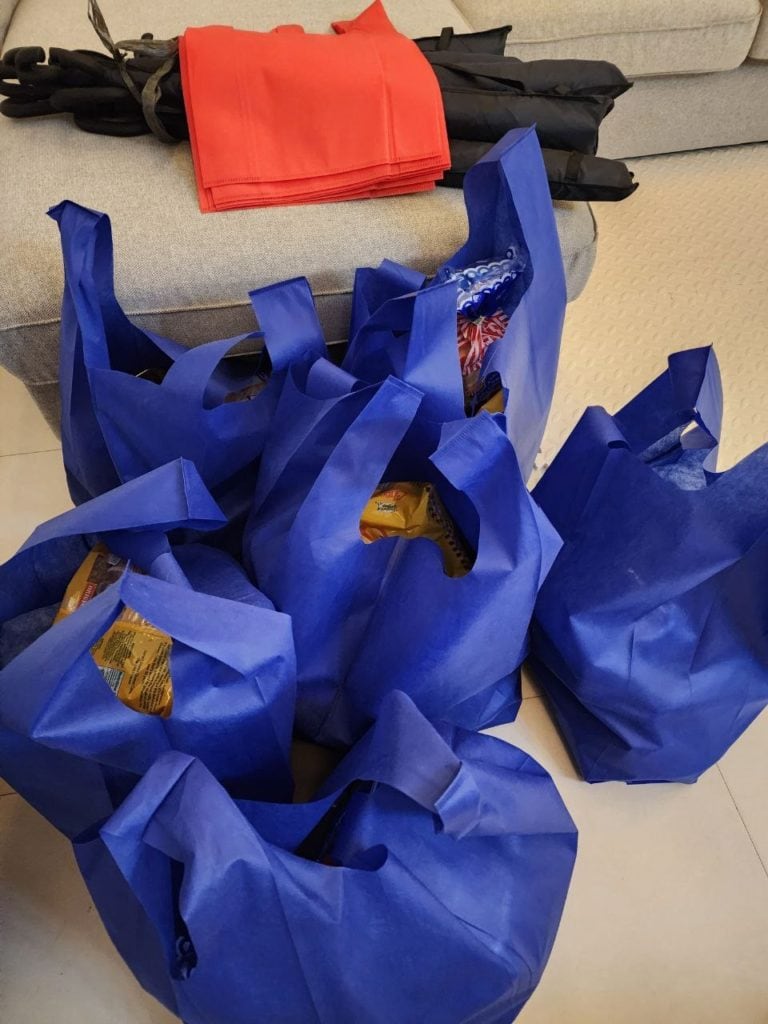
We often see a lot of homeless families in our city. Some are of old age and some with children. Tonight my wife and son and I drove around and gave grocery bags to some of these families. What a joy to see their smiles and happiness!
Does anyone ever tell you that your really really good at what you do? I work in audio (post production) for a living and I look at pro level stuff all day long every day and your work absolutely stands up to some and surpasses a lot of what I see.

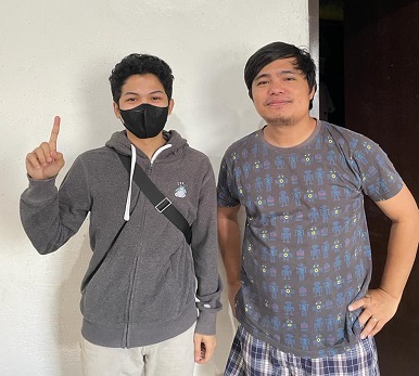
The man besides me is one of the associate pastors of our church. He really needed financial help because he has a rare disease called Ameloblastoma and needs to undergo a procedure. The amount of money from JFP is really a big help for him and to his family!
Johnny Flash did a great job on our new Wellesley Hills Congregational Church website. Delivered on time and on budget. They helped us shape good content as well.
We were so satisfied we had them redo our Wellesley Nursery School in the Hills website also.

Professional, knowledgeable, friendly! Everything you could ask for in a website development firm/SEO company. Johnny Flash Productions is the best website development firm and SEO firm in Northern Virginia!

Johnny Flash Productions has been a great partner for our business. Their team is responsive, knowledgeable, and truly cares about helping us grow. They handle updates quickly and consistently deliver high-quality results. We’re so grateful for their support and highly recommend them to anyone looking for a reliable, talented digital marketing team.

This process was so much easier than I expected. John listened carefully to what I was expecting to accomplish with our website and kept me focused on our objectives.
We are now able to register preschool students online (especially important during COVID). Parents are very happy that now they have the option to pay by credit card. I would highly recommend this company!

Johnny Flash Productions and their team were aces to work with. Their process was simple, and project schedule was on target.
More importantly, their Storybrand mindset opened us up to a whole new world for our website presence, business development and even our own client communication.

John was amazingly helpful and he held the attention of the audience very well. He has a passion for what he does that really shows!

We regularly get rave reviews about our website. Often other non-profits have asked us for a referral. Johnny Flash was easy to work with and has always been responsive to our needs. They provided several built in tools that help keep our website from becoming stale.

If you need a graphic design team, Johnny Flash is a helpful partner to have on hand. Their work is professional and creative. Their Project Manager was a true Godsend for us personally, keeping every project on schedule with grace and a smile!
John, Joli and Team provided the path forward for us on how to take our desire to have a brand new website to getting it launched and live. We started at a high level of who we were and what we wanted to accomplish with our website.
John provided an up front schedule of what tasks would be completed by when from their team.
There were tweaks along the way that we would make and feedback given, and it was always well received with the changes being made in a timely manner. Thanks John and Joli.

I was looking for a web designer who was not only talented, but could deliver - and keep delivering what I needed month after month. The team at Johnny Flash Productions brought ideas to the table that complemented what I wanted to do with my website and their design exceeded my expectations.
I was willing to pay more for their continuing monthly service than I had paid previously because they laid out what I could expect from their team. So far, they have under promised and over delivered.

Our organization couldn't be happier with the beautiful website Johnny Flash Productions created for us. They helped streamline thousands of components from our previous site into a site that portrays the mission of our organization and tells the story of our purpose while bringing in and engaging new and returning visitors.
We wouldn't hesitate to use them again and have already recommended them to several people who have seen the quality of our new site.
We have also seen a remarkable uptick in response in those who have gone to the site just in the first few weeks since launch in signing up for future communications. That is the sort of prolonged engagement we have been looking for, and Johnny Flash Productions delivered beyond our hopes.

Johnny Flash redesigned both our church website and our preschool website to align with our new branding, helped us switch web hosts and met some tight timelines as well. John and his team are always professional, have fresh ideas and are quick to respond to questions.
They also worked us to revamp both websites within our set budget while still providing a quality web design and custom look. If I could give them ten stars, I would!

They did excellent design work, were professional and responsive. They were an absolute pleasure to work with, and I plan on using them for future projects.

We are all super big fans of your work and love your passion and talent for design. All of us are so blown away by your incredible work on the anchor piece for A Better Story!
I don't know what we would have done without you. Thank you for being so amazing!!!

I've had an exceptional experience working with Johnny Flesh Productions for my website's search engine optimization. John and his team are not just experts in SEO, but they also make the process engaging and informative. Their prompt responses and unwavering professionalism stand out, making every interaction a pleasure. If you're looking for a team that delivers outstanding results and values client collaboration, Johnny Flash Productions is the go-to choice. Five stars all the way!"
JFP is amazing. My new website is very clean, conveys exactly what I want to my clients, looks way better than the competition, and will be the base for my company moving forward. And now I have a great working relationship with Johnny Flash Productions for all of my SEO and website needs. Don't hesitate to go with JFP, they're honest. They rock!
John and his team are great to work with. We have worked with them on a broad range of projects including logo development, campaign materials and website design. They are a great partner!

We’ve had the pleasure of working with Johnny Flash for the past couple of years. From designing and managing our website to optimizing our SEO and assisting with marketing efforts, they’ve consistently gone above and beyond. Their team is incredibly knowledgeable, responsive, and dedicated to helping us grow. Whenever we have a question or need support, they’re quick to provide solutions and always offer excellent guidance. We highly recommend Johnny Flash to anyone looking for a professional, reliable, and supportive digital marketing partner.

I have worked with Johnny Flash Productions on 3 of my own websites and recommended Johnny Flash productions to two other family members who were also in need of new websites. We have all had an exceptional experience during the process.
The staff are very responsive, organized, on time and they follow through until the work is complete. We valued them so much that we use them for our monthly maintenance and they help with our advertising online.

Sam was 6 when she was diagnosed with leukemia. After 1.5 years of treatment, she survived and continues to take medication. Everyone calls her the little warrior for her bravery. She has been a living testament to the family that God heals and makes miracles. We’re so thankful for the financial support for medication.
Can’t say enough good things about the team at Johnny Flash Productions. From beginning to end, their attention to detail was top-notch. John and his team were always ready to answer any and all questions throughout the process. We specifically hired JFP to build a website for my company from the ground up, and they delivered an incredible final product. The project manager assigned to our site was diligent, deliberate, and made the entire process smooth and efficient. We’re extremely pleased with the results and can’t wait to work with them again in the future.

Exceeded all expectations in their abilities to professionally evaluate and customize our company WordPress website. Above all else, their customer service is the best I've dealt with in a long time with any company I've worked with in the past. I definitely recommend Johnny Flash Productions to anyone looking for exceptional service, professional detail and customer support.

Working with John and his team has been such a wonderful experience! They consistently go above and beyond to quickly complete our requests, and it's great working with a team of true experts.
I highly recommend them for anyone looking for WordPress developers.

It has been such a pleasure working with John and Nicole to develop our WordPress website. The team is very professional and worked closely with us during the entire process. We couldn't be happier with the result, we love our new website.
I definitely recommend Johnny Flash Productions!

Amazing company to work with from start to finish. From Joli and the web design team to dealing with John directly these guys are true professionals. Couldn't be happier with our results and highly recommend.
We chose Johnny Flash Productions because I knew the person, John Falke. Relationships are important. Knowing character is important and relevant to business decisions. Knowing whether a person/business will stick by their word is important along with can they perform.
A company that can perform is good, but if they do not stick by their word, skill means nothing. You produced a great product, worked with us, gave a fair price and kept us on task.

Very helpful company would highly recommend!!

I must admit that I was not crazy about revamping our website, primarily due to the time commitment and cost. However, in looking through the updated content this morning, the new website looks terrific and was well worth the time and expense.
Thanks to you and your team for all of your hard work.

We have a fabulous website thanks to their excellent process.

Their knowledge of SEO and integration of social media channels improved our church's online impact.
We’ve been working with Johnny Flash for years, and they’ve consistently done an outstanding job for us. Their expertise and dedication shine through in everything they do. We trust their input and value their opinions when it comes to our website and social media presence. It’s always a pleasure collaborating with them, and we highly recommend their services without hesitation!

The Johnny Flash team is incredibly skilled, attentive and patient. We are very happy with our new WordPress website!
We had a phenomenal experience working with the Johnny Flash Productions team for our new website, SEO, and logo. We are excited and unequivocally satisfied with the results. Our website has received numerous positive reviews from our clients, associates, and friends. And their SEO services have already brought us new clients who found us online.

Johnny Flash Productions, is an Internet Marketing Industry Expert. I've had the pleasure of interacting with him in a Marketing Mastermind group, and as an industry person, I can say with confidence that John knows his stuff. He's an Expert's expert. His processes are solid, and he knows how to solve problems, and drive leads to your business. He's the real deal.

We love working with Johnny Flash! Their team is always helpful, prompt, and makes the process of everything we're doing a lot easier. From designs to social media, and their support team are all amazing! Thank you!

Excellent WordPress Web Designer, we are so lucky to have them design our website we were very satisfied with the results!
In a matter of weeks, the Johnny Flash team was able to help Care With Love immensely with ideas as well as practical implementations regarding our website and marketing plans. Their team is professional, responsive, and exemplify great customer service. Well done Johnny Flash Team!

We are truly grateful for our time working with John and his team. They were able to manage a full redesign within a relatively tight timeline and delivered an impressive site that also worked well through mobile devices as well.
They kept us on schedule as well and were a pleasure to work with. The team continues to be incredibly responsive following the initial launch.

Johnny Flash Productions gets results building stand-out websites that are optimized for success! Their team of professionals worked quickly to get to know my business and developed a plan of action. Their designers developed an amazing design that exceeded our expectations. If your organization or business is looking to build or improve your presence online.
I highly recommend Johnny Flash Productions!

John's proficiency inspires me!
We were so grateful to have found Johnny Flash Productions to help us with our marketing needs. Their work was above and beyond what we expected. The staff are very competent and great to work with. Excellent results!

Johnny Flash Productions helped breathe new life into Immanuel’s online presence with their wonderful redesign of our website. Aside from their consummate professionalism, flexibility and keen attention to detail, they were an absolute pleasure to work with.
It had to be a daunting task to be presented with the enormous number of expectations , hopes and ideas generated from our church’s website committee throughout the course of the website re-design, but if anything, Johnny Flash's resulting work exceeded all expectations.
I’m sure I can speak for all of us on the committee when saying that we’d heartily recommend Johnny Flash to any church or organization in need of a skilled, knowledgeable, easy-to-work with design company.

Was a pleasure to work with Johnny Flash Productions to walk through the full life cycle of a complete redesign of several of our ministries websites. Working with people who are experts caused us to think outside the box in how we really tell our story through our website.
The entire team was great to work with and the value has been incredible! God is good!

Johnny Flash Productions is a company that truly cares about their clients, this is obvious by not only their work ethic but they also the way they put their heart into every project they complete.
Johnny Flash Productions was a pleasure to work with, we look forward to working with them again in the future.

We have been very pleased with our website design experience with Johnny Flash. We appreciated how their structured process enabled our website team to prioritize our goals for the project and develop a final product customized to meet our individual needs.

I would like to thank Johnny Flash Productions for there great service my company has been able to get to get to the top of Google searches in half the time most companies take. I am now receiving 3 to 5 viable leads a day that all lead to service work for my company. And I can not thank them enough for all of there support with my site and maintaining it for me.

We couldn’t be happier with our experience working with Jhonny Flash Productions! From the very beginning, the team demonstrated professionalism, creativity, and an impressive attention to detail. They completely transformed our web presence, building a stunning, user-friendly website that truly reflects our brand and values. Special thanks to John, the owner, for setting the tone with his visionary leadership, and to Cassie, our incredible project manager, who kept everything running smoothly from start to finish.

John has been managing my website SEO and Google Ads for only a few months now and his services have already generated profitable leads. I can’t say enough about his company’s professionalism, promptness and results oriented approach. Hiring his company has been an excellent business decision!!

We began collaborating with Johnny Flash Productions in January 2023 with the primary goal of optimizing our SEO and achieving visibility on Google's first page. During our initial meeting, John provided thorough explanations and informed us that it could take up to six months to see results. Fast forward, and our company consistently appears on the first page of Google.

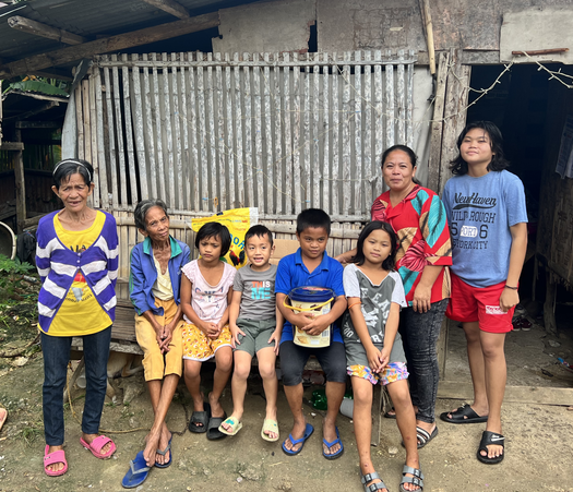
Joan is the breadwinner for her big family despite her husband not having a stable job. She cares for two elderly women, two young relatives who have lost their families, and five children who are students. We gave her money to help and she expressed her gratitude.
We met a wonderful woman who juggles several jobs while trying to take care of her two children, one of which has cerebral palsy and the other polio. We gave funds to help with medication as well as food. She couldn’t have been more thankful!

We had a great experience working with Joli and the team at Johnny Flash. Their whole process was very helpful to shaping and sharing our website message.

John is a good teacher. It's hard to find someone like him that has the knowledge and is able to impart what he knows.

We've worked with John and his team for several years on multiple projects. They deliver great work on time, on budget and with solid ongoing support. We highly recommend Johnny Flash Productions!

I cannot begin to speak highly enough of Johnny Flash Productions. I was first alerted to their company by doing a Google search & found only one company around with so many 5-star reviews, so was curious if they could all be real. I found through working with John & Eowyn & the Johnny Flash team that we were able to collaborate to create the perfect website for our organization.